
In this particular title, vibrant red colours are used to contrast with the black background. This colour scheme carries strong visual weight and is used to draw the viewer's eye due to its catchy, attention-grabbing nature.
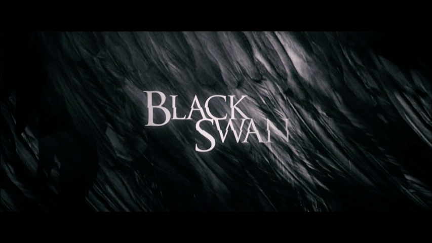
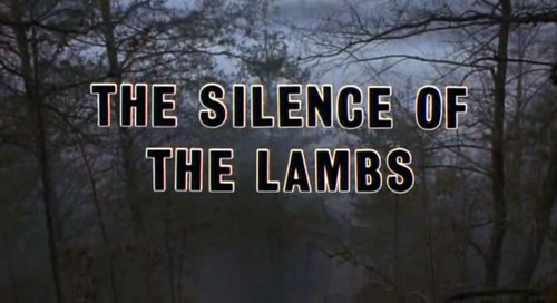
The black colouring combined with the faded, dark background in contrast to the faded white font colouring adds an element of mystery. The abstract nature of this background amplifies this.
Horror movies often use dark red colours and 'trail' effects (such as the titles dripping) to link it to the blood and gore themes frequently essential to the horror genre, as shown below.

The title of our Media Studies film opening project will be Quicksand. We have chosen this title because of the desert setting inspired by Mad Max: Fury Road, not to mention in our audience research questionnaire most of the votes were for Quicksand out of 4 options. It's short and catchy which reflects the genre and plot line of our fast-paced action-packed film opening well.

The film title shown above is made by Jack. This is the general layout we will be using for our film title opening. However, it also involves an animation effect that will need to be shot on the first Shooting Day therefore it cannot be displayed at the moment. Below is a video that shows our inspiration behind this idea from Borderlands 2.
No comments:
Post a Comment